Notes on Phys 272 'Goldilocks Plots': a brief conversation...
Every lab will have at least one modeling plot. To cheat the process, just scroll to the bottom to see what this whole page is building up to.
Good notebook skills involve making plots right there on the quadrille paper especially designed for the very purpose. One can quickly make reasonably neat tables too without a lot of effort, and then proceed to make quick work of a graph, or plot, even while the data is being taken. It helps to work in teams, one person calling out the measurements, another writing things down, or adding data points to the plot, and so forth.
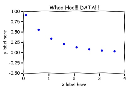
ANY plot will have axes and labels. Plots typically do not have titles in peer reviewed journals. Titles on the displayed plots below were put there for training purposes only (training the instructor that is...who is trying to teach himself something about 'matplotlib' in Python). What if you are observing some quantity decay in time, perhaps some radioactive substance of some sort, and someone calls out the readings of the Geiger-Counter, or a detector records the data and software is used to create a data set, say, and you make the scatter plot, so called, shown below.
Figure 1. A scatter plot, or a simple y-data vs. x-data plot.
Huh. I must've normalized the counts to the biggest count. Well, let's continue anyway...So, this is cool and all, and sufficient for the kind of graph one makes on the fly as one takes data. It shows trends and could confirm model expectations and so on. It can reveal where you have enough data and maybe not enough, which is clearly of importance while you are taking data. There must be plots like this in your lab notebook. It is a necessary intermediate modeling step. But the graph does not yet reflect how certain we are of each data point. The reader will know already that that uncertainty of the data point is to be noted when it goes in the data table, or rather when it's taken. The estimate will have been made already and the rationale for the estimate written down in the lab notebook! OK, so these uncertainties will be graphically depicted as error bars. These let us know how well we know the data points we are plotting. So a more developed graph looks like this now,
Figure 2. A scatter plot with simple error bars.
And this is great, but it isn't yet what we want in any final sense.
We want to use our model, whatever it is, to help us measure some quantity and determine an uncertainty in that quantity. How? If we can get some sophisticated program to (a) try a bejillion different values of a fitting parameter to find the model prediction for all possible values of the variable varied (i.e. the experimental 'independent variable'), which by the way gives us a curve of some sort, and (b) tell us what is the best curve by some statistical measure (e.g, $\chi^2$) and therefore the best fitting parameter, then we can use a model to compare with data and so 'measure' a best value of a fitting parameter. And this fitting parameter will either be the thing we are trying to measure, or will have bundled in it that thing we are trying to measure. In either case, we will get an estimate of the thing we hoped to measure. We do this by tossing the data into the data buffer in FITTEIA found at fitteia.org. The 'How-To' for this was described in the first lab of the semester. Anyway, we can easily and painlessly get the following plot or something like it, along with the the optimum fitting parameter and its uncertainty (written in an odd format), assuming we have the right model. In principle, we are done.
Figure 3. A scatter plot indicating the best fit value, uncertainty of the that value, and the best fit curve. Note that $\Delta t_{best}$ arises from fiddling with the fitting parameter that produces the Goldilocks plot, described presently....
'Goldilocks Analysis'...
But actually this is not quite satisfactory. We don't know how FITTEIA decided the uncertainty in the fitting parameter! So let's take on the responsibility ourselves. Take control of the fitting process by playing with the fitting parameter you care about directly, once the best fit has been determined Fitteia in the following way:
call the fitting parameter obtained by FITTEA, `JUST RIGHT'.
use the 'Free/Fix' buttons next to the fitting parameter to 'FIX', or adjust (edit), the fitting parameter value so that the new fitting curve is a little 'TOO BIG', that is, above the best fit curve, but still fits within the error bars, more or less. Call this value of the fitting parameter 'TOO BIG'. Then,
'Fix' the fitting parameter as just described so that the fitting curve now is a little 'TOO SMALL', that is, the new fitting curve is now under the best fit curve but clips the error bars still (more or less) on the low side of the best fit curve. Call this value of the fitting parameter 'TOO SMALL'.
Calculate the value of the uncertainty in the fitting parameter to be the difference between values 'TOO BIG' and 'TOO SMALL', divided by 2.
I think you'll see that the uncertainty in the fitting parameter is larger than what the CERN routine calculates for the FITTEIA output. But at least you'll know how the values were arrived at. This is procedure is what is meant by obtaining the uncertainty of a fitting parameter by making a Goldilocks Plot. It really just means that you've used this analysis (the Goldilocks Analysis) to estimate the uncertainty of the fitting parameter you care about.
Figure 4. A Goldilocks plot, a scatter plot with simple error bars, with 3 modeling curves, where the key fitting parameter is manually varied, choosing it to be now too big (but still within the error bars!), now too small, and and now JUST RIGHT, which determines the best fit and its uncertainty. You have to make a Goldilocks plot to tell the uncertainty in the fitting parameter.
Please note
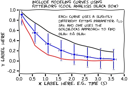
the difference in principle between the uncertainty in the fitting parameter, and the uncertainty in the measured data points! They will probably even have different units! You need to know both, you cannot really have one without the other, but probably only the uncertainty in the fit will make it into the abstract. Why? Because only this uncertainty quantifies the the goodness of the fit, how well the model and the data agree, something to appeal to, to look at when comparing discrepancies and experimental uncertainties and so forth.
the most significant digit of the uncertainty here determines the least significant digit of the best value. So, round things, to get just one digit of uncertainty.